
App Review: the Foursquare UI gets tarted up in app update
The Foursquare app for iPhone has just undergone a bit of an update. Its new incarnation is faster, a little better organised and sort of more bubbly around the edges.
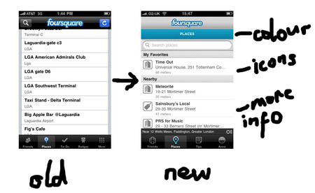
It’s not a major overhaul but it is a tarting-up, a spring clean of the user interface making things easier to navigate. That means more icons, the use of bold and colour in typefaces to make reading a bit easier and the introduction of bright green for alerts.
One feature I particularly like is the pull-down for refresh feature as seen on Tweetie and other such real-time apps. It means the refresh button doesn’t take up space on the header and it becomes more intuitive.
It claims it has faster more efficient checkin and shout flow too, as well as some features making it a bit easier to click through on stuff.